数据可视化及初步探索-数据分析与挖掘
知识点
- 可视化与数据挖掘的步骤
- Matplotlib 绘制图形
- Matplotlib 添加图形属性
- 等高线的绘制
- 泊松分布和正态分布的绘制
- Seaborn 密度估计图的绘制
- 单变量变量图的绘制
- 热力图的绘制
Matplotlib 模块介绍
Matplotlib 绘制线形图
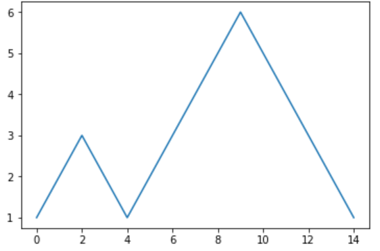
折线图是在序列中表达数据变量的统计图表,通常用于发现数据集中的趋势,其暗示数据的变化往往包含时间或其他特定因素。
from matplotlib import pyplot as plt  # 从 Matplotlib 中导入了 pyplot 绘图模块
y = [1, 2, 3, 2, 1, 2, 3, 4, 5, 6, 5, 4, 3, 2, 1]
plt.plot(y)
通常,
plot()接受两个参数。一个代表横坐标的数值,另一个代表纵坐标的数值但是,当你只传入一个参数
y的时候,它会默认代表纵坐标的值,而横坐标的值会从0到n-1,n为y数据长度
plt.plot([i for i in range(len(y))], y)
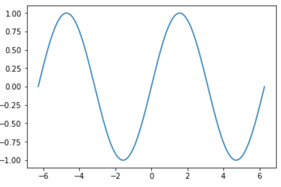
Matplotlib 绘图时,当点非常密集时,折线就会变成光滑的曲线。例如绘制正弦函数的曲线。
import numpy as np

# 在 -2PI 和 2PI 之间等间距生成 1000 个值,也就是 X 坐标
X = np.linspace(-2*np.pi, 2*np.pi, 1000)
# 计算 y 坐标
y = np.sin(X)

plt.plot(X, y)
Matplotlib 添加图形属性
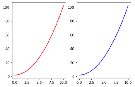
当你学会线型图绘制之后,可能想到改变图形的属性。例如,更改图形的尺寸、添加图例等。Matplotlib 提供的面向对象 API 使用起来非常简单,但是下面不再直接使用 plt.plot,而是定义一个绘图对象 fig, axes = plt.subplots()。
x = np.linspace(0, 10, 20)
y = x * x + 2
fig, axes = plt.subplots()
axes.plot(x, y, 'r')
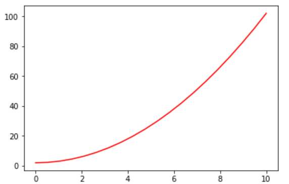
在这里,figure 相当于绘画用的画板,而 axes 则相当于铺在画板上的画布。我们将图像绘制在画布上,于是就有了 plot,set_xlabel 等操作。
如果要调节画布尺寸和显示大小,只需要向
plt.subplots中添加参数即可。# 通过 figsize 调节尺寸, dpi 调节显示精度 fig, axes = plt.subplots(figsize=(16, 9), dpi=50) axes.plot(x, y, 'r')可能需要绘制图名称、坐标轴名称、图例等信息。
# 绘制包含图标题、坐标轴标题以及图例的图形
fig, axes = plt.subplots()

axes.set_xlabel('x label')
axes.set_ylabel('y label')
axes.set_title('title')

axes.plot(x, x**2)
axes.plot(x, x**3)
axes.legend(["y = x**2", "y = x**3"], loc=2)
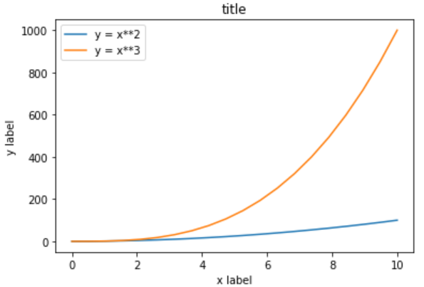
图例中的 `loc` 参数标记图例位置,`1,2,3,4` 依次代表:右上角、左上角、左下角,右下角;`0` 代表自适应。
- 同样,我们可以绘制子图。向
plt.subplots中添加参数nrows和ncols参数即可
fig, axes = plt.subplots(nrows=1, ncols=2)  # 子图为 1 行,2 列
axes[0].plot(x, y, 'r')
axes[1].plot(x, y, 'b')
Matplotlib 其他常见图形
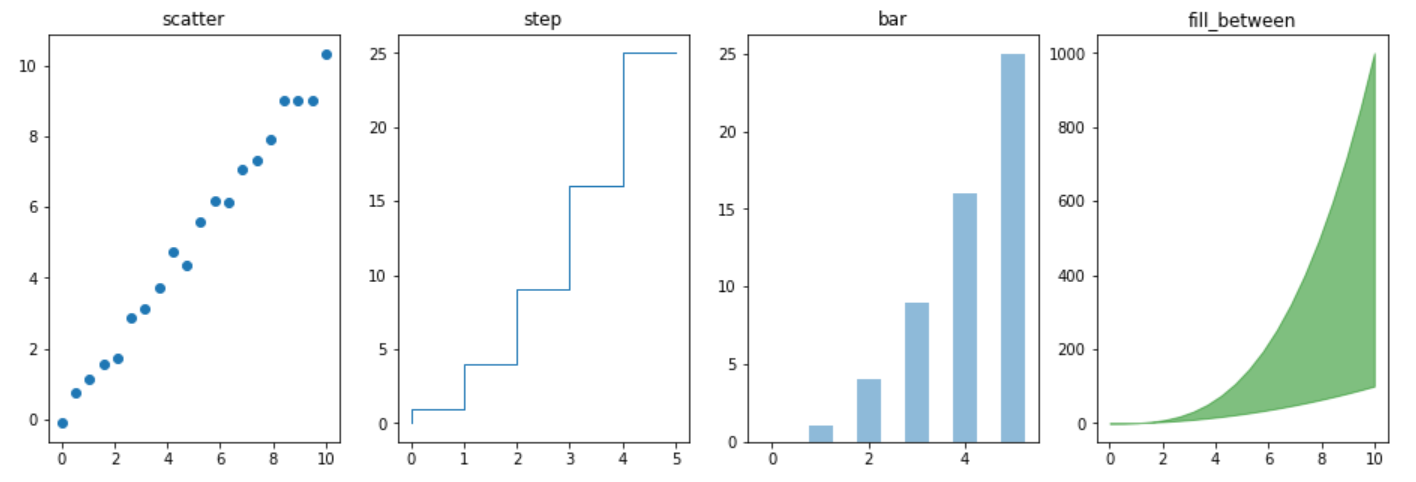
除了线型图,Matplotlib 还支持绘制散点图、柱状图等其他常见图形。例如:
n = np.array([0,1,2,3,4,5])
fig, axes = plt.subplots(1, 4, figsize=(16, 5))
axes[0].scatter(x, x + 0.25*np.random.randn(len(x)))
axes[0].set_title("scatter")

axes[1].step(n, n**2, lw=1)
axes[1].set_title("step")

axes[2].bar(n, n**2, align="center", width=0.5, alpha=0.5)
axes[2].set_title("bar")

axes[3].fill_between(x, x**2, x**3, color="green", alpha=0.5)
axes[3].set_title("fill_between")
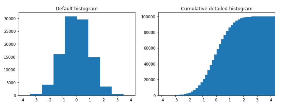
绘制直方图
n = np.random.randn(100000)
fig, axes = plt.subplots(1, 2, figsize=(12, 4))

axes[0].hist(n)
axes[0].set_title("Default histogram")
axes[0].set_xlim((min(n), max(n))) # Set the x-axis view limits.

axes[1].hist(n, cumulative=True, bins=50)
axes[1].set_title("Cumulative detailed histogram")
axes[1].set_xlim((min(n), max(n)))
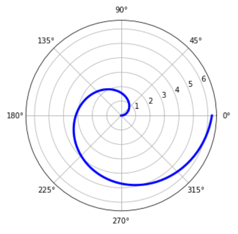
绘制雷达图:
fig = plt.figure(figsize=(6, 6))

ax = fig.add_axes([0.0, 0.0, .6, .6], polar=True)
t = np.linspace(0, 2 * np.pi, 100)

ax.plot(t, t, color='blue', lw=3)
Seaborn 模块介绍
Matplotlib 应该是基于 Python 语言最优秀的绘图库了,但是它有一个令人头疼的问题,那就是太过于复杂了。3000 多页的官方文档,上千个方法以及数万个参数,属于典型的你可以用它做任何事,但又无从下手。
Seaborn 基于 Matplotlib 核心库进行了更高级的 API 封装,可以让你轻松地画出更漂亮的图形。而 Seaborn 的漂亮主要体现在配色更加舒服、以及图形元素的样式更加细腻。
使用 Seaborn 优化 Matplotlib 图形
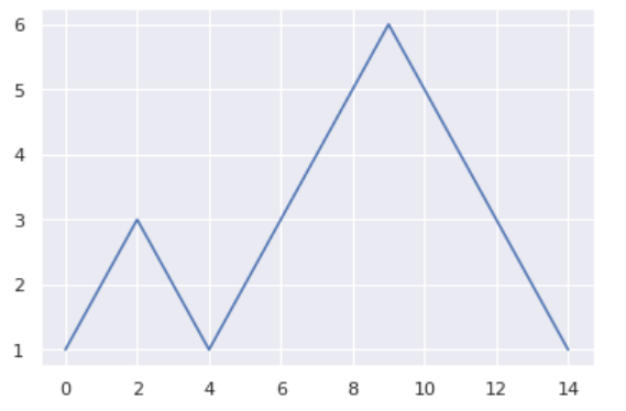
我们可以通过 Seaborn 对 Matplotlib 绘图完成样式快速优化。以前面的折线图代码为例,在 plt.plot(y) 这行代码前添加上 sns.set(style='xx'),指定一个预设样式,能让画出来的图形更加精美。
style 有 5 个参数可选:
darkgrid黑色网格whitegrid白色网格white白色背景ticks加上刻度的白色背景
import seaborn as sns

y = [1, 2, 3, 2, 1, 2, 3, 4, 5, 6, 5, 4, 3, 2, 1]
# 将画图风格设置为 darkgrid
sns.set(style='darkgrid')
plt.plot(y)
plt.show()
使用 Seaborn 绘制图形
Seaborn 支持常见的五类不同样式的图形绘制,你可以通过下方的思维导图了解。

接下来,我们使用 Seaborn API 来绘制常见的图形。
直方图
seaborn.distplot(a, bins=None, hist=True, kde=True, rug=False, fit=None, hist_kws=None, kde_kws=None, rug_kws=None, fit_kws=None, color=None, vertical=False, norm_hist=False, axlabel=None, label=None, ax=None)
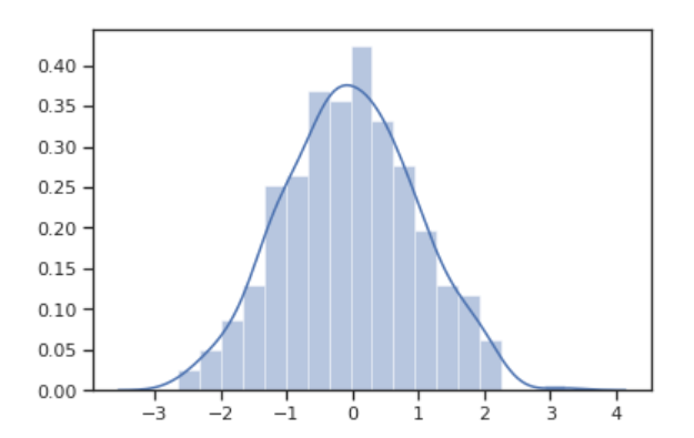
我们可以通过 seaborn.distplot 绘制单变量的直方图。下面,我们通过构造两个不同分布的数据集,并以画图展示。
正态分布
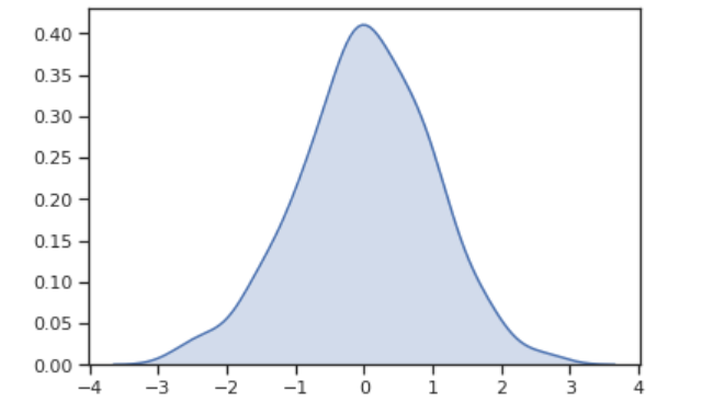
首先,我们来构造 正态分布 的数据集。
x = np.random.normal(size=500)
sns.distplot(x)
泊松分布公式
$$ f(k; \lambda)=\frac{\lambda^k e^{-\lambda}}{k!} $$
你还可以根据 泊松分布 公式,构造参数为 1 , 大小为 1000 的泊松分布数据集,并画出其分布图。
poisson = np.random.poisson(1, 300)
sns.distplot(poisson)
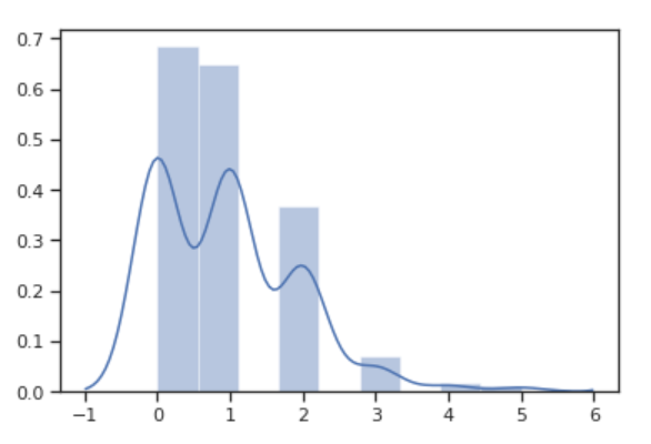
你可以发现,seaborn.distplot 不仅绘制了直方图,还自动添加了变化趋势曲线
组合图
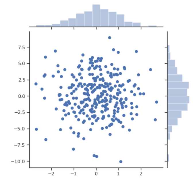
seaborn.jointplot 可以用来绘制单变量和双变量的组合图。
seaborn.jointplot(x, y, data=None, kind='scatter', stat_func=None, color=None, height=6, ratio=5, space=0.2, dropna=True, xlim=None, ylim=None, joint_kws=None, marginal_kws=None, annot_kws=None, **kwargs)
下面我们利用多元正态分布的公式和 NumPy 提供的函数来构造数据集,然后用 joinplot() 可视化两个变量之间的关系。
# 根据公式,构造数据集
mean = [0, 0]
cov = [[1, 0], [0, 10]] # 协方差矩阵
x, y = np.random.multivariate_normal(mean, cov, 300).T

# 画出 x, y 的联合分布图
sns.jointplot(x=x, y=y)
核密度估计图
核密度估计是在概率论中用来估计未知的密度函数,属于非参数检验方法之一。通过核密度估计图可以比较直观的看出数据样本本身的分布特征。
seaborn.kdeplot(data, data2=None, shade=False, vertical=False, kernel='gau', bw='scott', gridsize=100, cut=3, clip=None, legend=True, cumulative=False, shade_lowest=True, cbar=False, cbar_ax=None, cbar_kws=None, ax=None, **kwargs)
data: 一维数组shade: 是否保留阴影面积cut: 数轴极限数值的多少cumulative: 是否绘制累积分布
kdeplot 主要是用于绘制单变量或变量的核密度估计图。先看看单变量的效果。
# shade 参数表示是否需要曲线阴影面积
sns.kdeplot(x, shade=True)
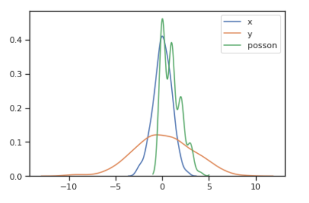
我们可以将三个变量的密度图在同一个图画出来,以便比较它们之间分布的差别。
sns.kdeplot(x, label='x')
sns.kdeplot(y, label='y')
sns.kdeplot(poisson, label='poisson')
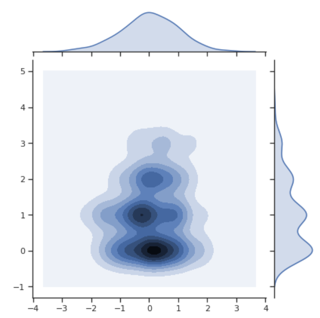
x(正态分布) 和 poisson 变量的联合密度图:
sns.jointplot(x=x, y=poisson, kind='kde')
计数图
计数图 countplot 是一类可以对数据集分类的直方图,使用图形显示每个分类中的数量,同时也可以比较类别间数量差。
seaborn.countplot(x=None, y=None, hue=None, data=None, order=None, hue_order=None, orient=None, color=None, palette=None, saturation=0.75, dodge=True, ax=None, **kwargs)